
TESLA COMMAND CENTER > Case study in enhancing Driver Focus through Multimodal UX/UI
PROBLEM STATEMENT
While observing modern vehicle interfaces, I noticed that many EVs—particularly Tesla’s—emphasize sleek, screen-based control while minimizing physical interaction. Although this design celebrates innovation and visual simplicity, it also presents challenges for a growing demographic of drivers who find touch-based systems overwhelming or distracting. The constant navigation through digital menus and reliance on software updates can hinder rather than enhance focus and safety.
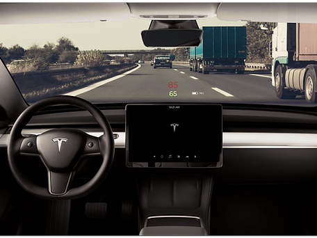
This tension inspired the Tesla Command Center: a conceptual redesign exploring how multimodal interaction—through a Head-Up Display (HUD), voice command, tactile feedback, and steering-wheel toggles—can reduce cognitive load and restore intuitive control. The goal was to design a driving interface that maintains Tesla’s technological sophistication while improving accessibility, confidence, and attention on the road.
PROJECT GOALS
-
Prioritize driver safety by minimizing distraction and maintaining focus on the road
-
Ensure reliable voice command functionality and simplified tactile interactions
-
Create a completely intuitive interface through multimodal input (HUD, voice, wheel toggles, smart screen)
-
Simplify and streamline essential controls for efficiency and ease of use
-
Support high-quality manufacturing and reliability through thoughtful interface integration
-
Maintain Tesla’s upscale aesthetic and innovation while reducing sensory overload
USER PAIN POINTS
-
Software glitches and inconsistent performance disrupt trust in the system
-
Distracting “pleasure” features compete with core driving functions
-
Subscription-based access to basic features creates frustration
-
Low-quality materials and lack of tactile feedback reduce satisfaction
-
Complex menus and unclear navigation make essential controls hard to locate
-
Overly visual, unintuitive UI increases driver distraction and learning time
USER RESEARCH
To understand how users interact with Tesla’s smart screen and how it impacts their driving experience, I conducted interviews and exploratory observations focused on driver comfort, attention, and trust in technology. The goal was to identify how multimodal interaction (voice, touch, and tactile) affects both focus and usability — especially for drivers less comfortable with rapidly advancing smart interfaces.
Research Methods
-
3 in person user interviews (Tesla and EV owners)
-
2 digital survey participants
-
Observations of interface use and driver behavior patterns
Key Findings
-
Users appreciate smart screen size and accessibility but find menu navigation inconsistent and distracting.
-
Many rely primarily on GPS and camera displays but avoid deeper settings or features while driving.
-
Voice commands are underused or repeated due to misrecognition or latency.
-
Touchscreen-only controls create discomfort — users miss mechanical buttons for fast, familiar feedback.
-
Screen overload and “pleasure” features (e.g., games, streaming) cause cognitive fatigue and reduce perceived safety.
-
There is a clear need for simplified, trustworthy multimodal control that aligns with diverse user comfort levels and driving habits.
USER INTERVIEWS
I conducted qualitative interviews focused on drivers’ real experiences using smart car interfaces. While participants varied in age and tech proficiency, their collective insights reflected consistent tension between innovation and usability. The focus was on uncovering the relationship between technology proficiency, cognitive load, and safety.
User Profiles
-
User I – Experienced EV Owner
Prefers advanced features but expresses frustration with inconsistent voice command accuracy and redundant touch-screen navigation. Prioritizes efficiency and safety over novelty.
“The tech is amazing, but not while I’m driving.”
“I just want simple, reliable options that don’t take my eyes off the road.”
“I can’t find what I need fast enough — it shouldn’t be that complicated.”
-
User II – Low-Tech Driver
Finds smart screens distracting and relies on physical controls. Experiences anxiety when forced to navigate layered menus while driving. Values simplicity and tactile feedback.
“I wish it had real buttons.”
“I end up looking at the screen more than the road.”
“It’s too distracting — I’d rather just drive.”
KEY TAKEAWAYS
Smart screens amplify both empowerment and distraction
Users appreciate the technological sophistication of EV interfaces but often feel overwhelmed by layered menus and sensory input.
Physical feedback is still critical
Drivers expressed a preference for tactile controls and muscle memory, noting that screens alone reduce focus and slow down response times.
Voice command reliability determines trust
Users value voice control for safety and convenience but reported frustration with inconsistent responsiveness and poor contextual understanding.
Simplification equals safety
Participants linked cognitive overload directly to safety concerns, emphasizing that essential driving functions should remain separate from entertainment or “pleasure” features.
Customization must be intuitive, not optional
Drivers wanted the ability to tailor their interface to personal comfort levels — choosing between manual, touch, or voice — without navigating complex settings.
HOW INSIGHTS INFORMED DESIGN
Through user interviews and observation, several key challenges became clear: drivers struggled with distraction, sensory overload, and limited tactile feedback when using Tesla’s smart screen. Many actions—like adjusting settings or navigating menus—required too much visual attention, which undermined focus and safety.
During ideation and word association exercises, these findings reshaped the team’s approach. What began as a redesign of the Command Center interface evolved into a multimodal system—one that engages multiple senses to support instinctive, in-motion decision-making.
We recognized that driving is not a static task; it’s a series of split-second reactions guided by habit, spatial awareness, and muscle memory. To align with this, the design expanded beyond the central screen to include:
-
Voice commands for hands-free control.
-
Steering wheel toggles for quick “yes/no” inputs.
-
HUD (Head-Up Display) projections that minimize eye movement.
-
Subtle tactile cues, such as braille-like feedback, to reinforce non-visual interaction.
This integration of multiple input modes transformed the concept from a digital dashboard into a responsive driving assistant, built to anticipate rather than interrupt user behavior.
USER PERSONAS
To design for both the “tech-proficient” and the “tech-cautious” driver, I developed two key personas that represent Tesla’s contrasting user base. Alfred embodies the retired, safety-focused driver who values reliability and mechanical familiarity, while Patricia reflects the multitasking commuter seeking efficiency and intuitive technology. These personas highlight the tension between innovation and accessibility—how the same interface can feel empowering to one user yet overwhelming to another.


IDEATION AND INNOVATION
Guided by user pain points around safety, overwhelm, and loss of tactile control, I began the ideation phase by questioning whether the solution could extend beyond a single command center. Through user research and word-association exercises, it became clear that the act of driving is largely instinctive — requiring split-second reactions and minimal cognitive load. Therefore, the system itself had to anticipate user behavior rather than depend on deliberate screen navigation.
The design evolved into a multimodal interface—integrating wheel toggles, voice activation, and a heads-up display (HUD) to reduce visual dependency and improve safety. By separating “need” functions (navigation, safety alerts, calls) from “pleasure” features (music, entertainment, personalization), the system supports both focus and ease of use.
Concept Testing
The initial prototype was presented to peers and instructors for evaluation. Feedback emphasized the need for clearer visual hierarchy and more fluid transitions between voice, HUD, and wheel-based interactions. This feedback led to refinements in the layout, menu organization, and responsiveness of the Command Center—resulting in a design that better supports quick, instinctive decision-making while driving.
Key Design Directives
-
Prioritize driver focus and safety through simplified, glanceable interfaces.
-
Enable multimodal control—voice, wheel toggle, and HUD—so essential actions can be accessed without distraction.
-
Divide “need” and “pleasure” features to minimize cognitive overload.
High-Fidelity Prototype Screens
Final prototype screens showcasing multimodal control, streamlined interface design, and enhanced driver focus.


JOURNEY MAP
Alfred’s journey map follows a simple weekly task—driving to the grocery store—but reveals how the current Tesla interface adds unnecessary cognitive load to an otherwise familiar routine. While Alfred appreciates the car’s advanced safety features and voice command capabilities, he often feels distracted when navigating menus, adjusting settings, or dragging the map while driving. His emotions shift noticeably throughout the trip: from focused and composed at the start, to overwhelmed during screen interactions, to slightly anxious when features are hard to locate quickly. Key pain points—remembering menu locations, toggling between screens, and the lack of clear hierarchy—underscore how even a confident driver can struggle with an interface that competes for attention on the road. Mapping Alfred’s experience clarified where the redesign needed to reduce friction, simplify decision-making, and support safer, more intuitive interaction patterns.

USER SCENARIO
To understand how different types of drivers interact with Tesla’s smart screen, I created two user scenarios based on interview insights and behavioral observations. These scenarios illustrate the daily realities, frustrations, and cognitive demands placed on drivers—from a multitasking working parent to a retired user who prefers tactile, mechanical interactions. Each scenario reveals where the current interface introduces friction and where a redesigned command center could meaningfully improve safety, clarity, and ease of use.
SCENARIO I: PATRICIA
Context:
Patricia is a busy accountant commuting from Ft. Lauderdale to Miami with her young son. She relies heavily on routine, convenience, and voice commands to manage her mornings efficiently. She represents users who balance parenting, work, and multitasking—and who expect technology to support rather than hinder their flow.
Journey:
It’s 8 a.m., already hot outside, and Patricia turns on the car’s air conditioning while making her coffee. She loads her son Tommy into the car and chooses her “User 1” profile on the smart screen; the system adjusts to her presets. She enters her Miami office address and adds a stop at Tommy’s school to account for traffic.
On the road, Tommy asks for music. Her voice command—“Play Tommy’s playlist”—isn’t recognized the first time, so she repeats it louder. Music starts, she shifts into drive, and begins her 12-minute trip to the school. After drop-off, she continues her 30-minute commute, sets the car to autopilot, and finally arrives at her office.
Outcome:
Patricia’s drive is uneventful but illustrates a key problem: voice commands feel unreliable, and she often has to repeat tasks that should be seamless. Her scenario emphasizes the need for a more responsive system that adapts quickly, avoids distraction, and supports drivers who depend on hands-free interaction.
SCENARIO II: ALFRED
Context:
Alfred is a retired user who values comfort, safety, and clear information more than novelty. He prefers predictable tools, mechanical controls, and minimizing distractions while driving. He represents users who are not “smart-phone-proficient” and may struggle with menu density.
Journey:
On a cool morning, Alfred heads out to pick up weekly groceries. He unlocks the car with a swipe and says, “Lock doors,” hearing a soft click. He adjusts the temperature with a voice command—“I’m cold”—and wipes the windshield, using the lever rather than the screen.
As he drives, he frequently checks mirrors and finds the smart screen distracting when switching between cameras and side views. He says, “Navigate to Doris’ Market,” and the route loads. While navigating, he drags a finger across the map for street names, but finds it hard to focus on both the screen and the road.
Approaching a neighborhood area, the car disables autopilot because lane markers fade, requiring Alfred to take full control. After 15 minutes, he arrives, parks, unbuckles, and locks the car.
Outcome:
Alfred’s scenario highlights cognitive overload and physical difficulty in managing a single large screen while driving. The interface demands too many gestures and visual checks at moments when safety depends on instinctual, low-effort interaction. His experience demonstrates the need for multimodal interaction—HUD, wheel toggles, simplified menus, and clearer hierarchy—to support users with different comfort levels and styles of driving.
USER FLOW
To understand how drivers interact with Tesla’s smart screen across different tasks, I mapped the full end-to-end user flow of the existing system. This diagram breaks down the pathways drivers must navigate—searching locations, adjusting car settings, using media, activating autopilot, placing calls, and managing safety alerts. By visualizing every branching decision point, it became clear where cognitive overload occurs, where essential features are buried within deep menus, and where drivers must divide their attention between the road and the interface. This flow served as a foundation for identifying opportunities to streamline tasks, reduce decision fatigue, and create a safer, more intuitive multimodal design.
.jpg)
A user flow diagram showing how Tesla’s existing interaction paths contribute to cognitive load and distraction while driving.
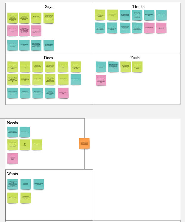
SCENARIO MAPPING
To understand how different drivers interact with Tesla’s smart screen ecosystem, I created a scenario map that synthesizes insights from multiple users. Each color in the exercise represents a distinct driver, revealing a broad range of behaviors, frustrations, safety concerns, comfort levels with technology, and interaction patterns. Mapping what users say, think, do, feel, need, and want allowed me to clearly see where cognitive overload occurs and where Tesla’s current interface falls short for drivers with varying levels of tech proficiency.
Scenario Summary:
Across users, several themes repeatedly emerged:
• “Tech-comfortable” users appreciated the advanced features but still struggled when tasks required shifting attention between menus, navigation, mirrors, and the road. They favored efficiency and expected the system to adapt to them — not the other way around.
• “Low-tech” or older users expressed tension between traditional driving habits and Tesla’s touch-heavy interface. They preferred mechanical buttons, felt overwhelmed by layered menus, and often relied on trial-and-error to complete basic tasks.
• Multitasking parents and commuters found it difficult to adjust settings while managing the demands of real-world driving (kids, traffic, time pressure). They needed quick, predictable actions that didn’t pull visual attention away from the windshield.
• Safety-focused users were highly sensitive to anything that caused their eyes to leave the road — even for a moment. These users consistently voiced concerns around distractions created by previewing maps, toggling modes, or adjusting screen brightness.
Despite these differences, all users shared a common pattern: driving requires split-second decision-making, and the interface must match the speed and automatic nature of those reactions.
Outcome:
The scenario map revealed that all users—regardless of age or tech comfort—experienced friction when tasks required shifting visual attention away from the road, navigating layered menus, or performing multi-step actions. These insights led to a redesign that elevates essential information to the HUD, moves quick actions to the wheel toggles, and simplifies the Command Center for faster, safer interactions. Together, these changes support more intuitive, instinctive driving behavior with reduced cognitive load.
_edited.jpg)
WIREFRAMES
Although traditional low-fidelity sketches were not a major part of this collaborative course project, our team relied heavily on user journeys, scenario mapping, and task flows to guide the interface design. These strategic artifacts served as our functional wireframe stage, enabling us to transition efficiently into high-fidelity prototyping while maintaining a research-driven, safety-focused approach.
FINAL DESIGN & INTERACTIVE PROTOTYPE
The final design brings together the project’s core insights—reducing cognitive load, improving safety, and restoring intuitive control through multimodal interaction. The redesigned Command Center integrates streamlined menus, a simplified visual hierarchy, and seamless transitions between HUD, wheel toggles, voice commands, and the central screen. This interactive prototype demonstrates how the system supports faster, more instinctive decision-making while driving.


High-fidelity screens demonstrating Tesla's Command Center final user experience.

Watch the interactive prototype in action.